 Architrave Journal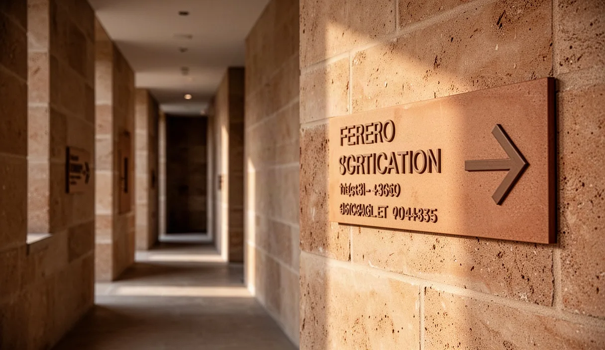
Wayfinding failure is rarely a failure of graphic taste. More often, it represents a breakdown in applied geometry, photometrics, and spatial comprehension. When a visitor stalls at a subterranean transit concourse or hesitates in a hospital atrium, the breakdown can usually be traced back to drawings where signs were treated as two-dimensional graphic overlays rather than physical interventions in a three-dimensional visual field. The built environment introduces competing stimuli: variable illumination, structural occlusions, dynamic pedestrian traffic, and complex surfaces. Legibility under such conditions demands a deterministic methodology rather than intuitive typography.
To design an informational system that reliably guides users, environmental graphic designers and architects must balance visual physics against human sensory limits. Spatial orientation relies on immediate, frictionless decipherability. Achieving this requires precise mathematical relationships between letterforms and observer distance, verifiable luminance contrast under real-world daylight fluctuations, and rigorous spatial placement relative to circulation decision points. The following principles outline the technical mechanics required to execute functional, legible architectural signage in complex civic spaces.
Mathematical Formulas for Viewing Distance and Type Size
Specifying type sizes by visual preference in architectural drawings frequently produces under-scaled lettering that fails basic legibility criteria. The baseline standard for public legibility rests on visual acuity metrics, specifically compensating for observers with 20/40 vision, which represents the threshold required for driver licensing in many jurisdictions and serves as a defensible baseline for general accessibility. An observer with 20/40 vision requires letterforms twice the size of an observer with standard 20/20 vision to achieve equivalent legibility.
The standard visual angle required for reliable decipherability by the 20/40 eye is roughly ten minutes of arc. To determine the necessary capital letter height (known as cap height, denoted as H), designers can apply a distance-to-height ratio. In static environments with ample dwell time, a ratio of 1:250 is functional. In high-traffic transit hubs, emergency egress routes, or environments where observers are moving quickly, the ratio must be compressed to 1:200 or 1:175 to account for visual processing time and ambient distractions.
The calculation can be stated as:
H = D / R
Where H is the cap height in millimeters, D is the maximum intended viewing distance in millimeters, and R is the legibility factor (typically between 200 and 250). For an observer required to identify a directional heading from an approach distance of 15 meters (15,000 millimeters), applying an R factor of 200 yields:
H = 15,000 / 200 = 75 millimeters
| Viewing Distance | Standard Ratio (1:250) | Transit / High-Speed Ratio (1:200) | Accessible Egress Ratio (1:175) |
|---|---|---|---|
| 3 meters | 12 mm | 15 mm | 17 mm |
| 6 meters | 24 mm | 30 mm | 34 mm |
| 12 meters | 48 mm | 60 mm | 69 mm |
| 18 meters | 72 mm | 90 mm | 103 mm |
| 24 meters | 96 mm | 120 mm | 137 mm |
Letter proportions are equally critical. The x-height of lowercase glyphs should sit between 70% and 75% of the cap height. Stroke widths must maintain an aspect ratio between 1:5 and 1:8 relative to the cap height. Narrow stroke widths degrade quickly under distance, while overly bold strokes fill in the negative space within counter-forms, rendering characters like 'e', 'a', and 'o' illegible blurs under poor viewing angles.
Luminance Contrast Testing in Ambient Architectural Light
Type sizing guarantees visual presence only if the glyphs separate cleanly from their backing plate and the backing plate separates from the surrounding architecture. Color contrast alone is insufficient, as two hues with identical luminance values become indistinguishable to an observer with anomalous trichromacy (color vision deficiency) or under monochromatic sodium or blue-shifted architectural lighting. Contrast must be quantified using Light Reflectance Value (LRV), which measures the percentage of light reflected by a surface on a scale from zero (pure absorptive black) to 100 (pure reflective white).
The standard luminance contrast calculation between a foreground character and its background substrate relies on the Weber contrast formula or the Michelson formula, but accessibility codes routinely reference the simplified contrast equation:
Contrast % = [(L1 - L2) / L1] * 100
Where L1 is the LRV of the lighter surface and L2 is the LRV of the darker surface. To achieve legibility for individuals with low vision, visual cues generally demand a minimum contrast value of 70%. In high-glare environments, targeting an 80% to 85% differential is more reliable. For instance, pairing a dark bronze sign panel (LRV of 9%) with off-white lettering (LRV of 74%) yields a calculated contrast of 87.8%, satisfying functional demands.
Field verification requires testing under ambient light with a calibrated spot luminance meter. Measuring candelas per square meter (cd/m²) under distinct daylight phases reveals vulnerabilities that digital color palettes conceal:
- Direct Solar Wash: South-facing or west-facing curtain walls can cast up to 40,000 lux onto an interior surface, causing veiling reflections that negate the perceived contrast of semi-gloss or gloss substrates.
- Overhead Downlighting: Recessed ceiling fixtures placed directly above an overhead sign project severe shadows across dimensional or tactile letters, obscuring the upper halves of characters.
- Night cycle transitions: Backlit panels that appear balanced under daytime illumination frequently produce excessive halation or light bleed at night, obliterating thin stroke letterforms.
Determining Key Decision Intersections on Complex Plans
Circulation breakdowns occur when navigational information arrives after a pedestrian has committed to a physical pathway, or when too much information is presented at once. Placing a sign panel directly at a structural divergence point forces pedestrians to halt, creating counter-flows and congestion. Wayfinding elements must be positioned along circulation sightlines prior to decision intersections.
A decision point exists at any architectural node where circulation diverges: corridor junctions, changes in floor level via elevators or stairs, transitions between exterior and interior zones, and exits from large open floorplates into egress channels. Determining these locations requires spatial syntax analysis, tracing the observer's isovist, which is the volume of space visible from any single observation point along a pathway.
Effective sign placement respects the human cone of vision. While normal peripheral vision spans approximately 120 degrees horizontally, comfortable visual recognition of text occurs within a tighter cone of 30 to 40 degrees centered along the line of travel. The vertical field of vision is asymmetrical: the natural resting line of sight is roughly 10 to 15 degrees below the horizontal horizon, meaning overhead signage should only be used when ceiling height and floorplate depth allow an approach view that does not require steep upward neck flexion.
Sign placement protocols require three distinct operational zones along an approach route:
- Announcement Zone: Placed 12 to 20 meters prior to an intersection. Confirms the approach to a major circulation node and lists primary destinations.
- Decision Zone: Placed 3 to 8 meters prior to the threshold. Directs movements into specific corridors or vertical circulation elements using clean directional arrows and concise terminology.
- Confirmation Zone: Placed 2 to 5 meters past the intersection along the newly entered pathway. Assures the user that the correct route was selected and reassures spatial orientation.
Substrate Selections for High-Wear Public Environments
A sign assembly that deteriorates, scratches, or absorbs finger oils quickly loses its optical performance. Material choices must resist environmental wear, chemical cleaning regimens, and physical vandalism while maintaining tight gloss tolerances to prevent glare. Specifying high-gloss plastics or unprotected metals in public corridors almost always leads to premature maintenance issues.
| Substrate Material | Gloss Range (60-Degree Meter) | Vandalism and Abrasion Resistance | Standard Replacement Cycle | Primary Optical Failure Mode |
|---|---|---|---|---|
| Porcelain Enamel on Steel | Matte to Semi-Matte (15 - 25 GU) | Extreme; impervious to solvents and scratching | 25 to 40 years | Chipping along edges if struck with heavy freight |
| Anodized Aluminum (Class I) | Satin (20 - 35 GU) | High; scratch resistant, vulnerable to strong acids | 15 to 20 years | Uneven patina or finish wear from frequent finger contact |
| Phenolic / High-Pressure Laminate | Low Sheen (10 - 20 GU) | Moderate; prone to gouging with sharp tools | 7 to 12 years | UV degradation and surface delamination in exterior edge conditions |
| Low-Iron Back-Painted Glass | Ultra-Low / Frosted (8 - 15 GU) | High; resistant to chemical cleaners and ink | 20 to 30 years | Rear delamination if inappropriate adhesives are used |
Specular reflections are a frequent culprit in field legibility failures. Specifying a matte finish (measuring between 10 and 25 Gloss Units on a standard 60-degree gloss meter) disperses incoming light and prevents hot-spot glare from architectural luminaires. Clear protective coatings over graphics must be evaluated carefully; broad-spectrum anti-graffiti coatings can introduce an unintended surface sheen that alters the measured luminance contrast of the underlying graphic.
Mechanical mounting detailing must also be durable. Concealed tamper-resistant fasteners, such as pin-in-torx hardware or internal keyhole extrusions, keep panels secure against the wall. Sign panels must sit flat against their host substrates. A gap of only 3 millimeters between a panel backer and a textured masonry wall invites physical leverage, resulting in bowed faces and skewed viewing angles over time.
Field Legibility Audit for Commissioned Buildings
The commissioning phase of architectural construction typically oversees thermal envelopes, mechanical ductwork, and electrical circuits. Rarely does it evaluate informational systems with equivalent rigor. A comprehensive field legibility audit must occur after ambient lighting is fully commissioned, architectural finishes are installed, and protective films are stripped from surfaces, but prior to public opening.
Auditors should follow a clear inspection procedure:
- Illuminance Verification: Measure vertical illuminance across the face of each sign panel using an illuminance meter calibrated to cosine response. Confirm that vertical light levels reach a minimum of 100 to 200 lux in normal circulation paths, without dropping below 50 lux in low-priority utility paths.
- Stationary Acuity Cross-Checks: Mark the predetermined legibility distances on the floor with removable tape. A technician with verified 20/40 vision evaluates the typography to verify that message strings, room identifiers, and tactile elements resolve quickly and without hesitation.
- Walk-Through Glare Analysis: Approach the sign from both primary and oblique angles (up to 45 degrees off-axis) during peak midday sunlight and full nighttime conditions. Check for specular glare from overhead architectural lighting or window openings that might wash out the typography.
- Occlusion Sweep: Walk the entire path of travel to ensure that unexpected ceiling drops, hanging emergency exit luminaires, surveillance cameras, or directional acoustic baffles do not sever the visual line of sight along the calculated approach.
Every non-compliant sign must be documented with photographic evidence, precise coordinates on the architectural plan, and measured lux readings. A formal audit report establishes accountability before the fabrication warranty expires.
Common Mistakes
Signage and wayfinding systems frequently repeat preventable errors:
- Viewing Distance Miscalculation: Calculating approach paths as flat, horizontal lines while ignoring vertical parallax. A directional sign suspended 4 meters above the floor in a tall rail hall requires a significantly larger cap height than a sign mounted at 1.6 meters, because the observer's viewing angle increases the true optical distance.
- Visual Clutter at Arrival Portals: Stacking room numbers, directional arrows, donor recognitions, and egress maps onto a single surface. Overcrowded layouts introduce visual friction that slows message decipherability.
- Neglecting Ambient Shadow Casts: Designing raised or photopolymer tactile characters directly below strong grazing wash lights. This practice casts harsh shadows across the letters, modifying the visual shape of the glyphs and confounding low-vision users.
- Uncalibrated Digital Color Specs: Relying on digital screen palettes to specify architectural finishes. Pigment formulations and powder coatings behave differently under broad-spectrum LED lighting than they do on an illuminated computer monitor.
Practical Next Steps
To integrate wayfinding legibility into upcoming architectural packages, immediate planning steps should be taken early in the design schedule:
- Extract Sightline Sections in BIM: Do not verify signage solely on floor plans. Cut diagonal sections through corridors, atriums, and escalators to trace real-world sightlines against structural drops, signage clearance heights, and MEP routes.
- Procure Scaled Physical Mockups: Fabricate 1:1 scale mockups of typical directional and overhead signs using specified typefaces and prospective substrates. Place them in the raw building shell under temporary or finalized lighting prior to full production runs.
- Build an LRV Sample Matrix: Gather physical swatches of all interior wall finishes (plaster, wood paneling, acoustic felt, stone) alongside sign face materials. Measure their light reflectance with an optical instrument rather than relying on manufacturer-reported approximations.
- Engage Specialist Accessibility Review: If working under stringent regional accessibility codes, collaborate with an accessible design professional or human factors engineer early in the design development phase to ensure tactile, visual, and mounting height specifications fully align with the governing regulatory standards.